Good UX writing and microcopy are crucial for creating interfaces that not only feel intuitive but also encourage engagement and conversion. Want your interfaces to be user-friendly and boost your success metrics? We’ll show you how to achieve that, with a couple of easy-to-follow examples to guide you.
How often do you shop online? How many buttons catch your eye daily? And how many do you actually stop at?
Read on to grasp how to draw users’ attention and create a button, call-to-action (CTA), or message that’s straightforward, impactful, and encourages conversions.
What will you learn from this article?
What is UX writing?
What is microscopy?
What differentiates UX writing from microcopy, and what do they have in common?
How to write a good microcopy?
Where can you find examples of interesting microcopy?
Sounds good? We know. Let’s get to it!
UX Writing Explained
UX writing goes beyond short texts you see on buttons or error messages, often confused with microcopy. It’s a comprehensive field dedicated to creating content for user interfaces. The essence of UX writing lies in its power to shape the users’ perception of your offer and influence their actions: whether they decide to leave your website or proceed to convert.
Remember: Microcopy is an important part of UX writing, but it’s just one piece of the bigger puzzle.
Now, let’s imagine a UX writer. What does their daily work involve, and why is their expertise so sought after?
A UX writer works on things like:
Labels and buttons. They make sure every part of an app or website is named in a way that’s easy to get. So, users know exactly where to click for their account settings or to peek at their shopping cart.
Error messages. Ouch! Nobody’s happy when a website crashes. But, if something goes wrong, UX writing helps by making the problem and solution clear, significantly preventing a – totally justified – user frustration. And remember, a frustrated user isn’t likely to convert.
Tips and guidance. It’s all about showing users how to use your app’s features without scratching their heads. Sure, those features should be pretty straightforward to use, but a little UX writing can go a long way in guiding them.
The overall tone and style. Creating a cohesive brand image starts with content, including the text on buttons, menu options, and messages. A tech company might not use a cookie icon to talk about cookie policies, but a brand for dog lovers? That could fit just perfectly! ?
A UX writer teams up with:
UX/UI Designers. They work out where things go on the screen and how to fit the words in.
Product Managers. They figure out what the app should do, how it helps users, and where words need to come in to make that clear.
Developers. They are often the ones who integrate the texts into the application’s code.
Put simply, a UX writer makes sure the words in your app are:
Clear, so users know exactly what’s going on and what to do next.
Helpful, because the words guide users step by step through the app.
Enjoyable, making using the app feel good because of the easy-to-follow instructions and nice wording.
Microcopy Explained
So, we’ve clarified that UX writing isn’t the same as microcopy. But what exactly is microcopy?
It’s those brief bits of text you see all over apps and websites – like the tiny descriptions, error alerts, quick tips, and other helpful snippets guiding you as you click around. Though they might seem minor, neglecting them can make a huge difference (in a negative sense, ofc).
What Are the Features of Good Microcopy?
Straight to the point. No room for fluff. A skilled UX writer (yep, they write microcopy too!) keeps it concise and on point.
Easy to understand. Forget the tech talk. Good microcopy makes sense to everyone.
Helpful. Confused about what to do next? Microcopy is there to guide you, in a friendly way.
Has a friendly tone of voice. Even an error message can be nice or a little funny, avoiding frustration. It’s about keeping things positive with users, especially when things go wrong.
Consistent. It all has to match. A consistent style and tone across the interface are a must for any microcopy.
source: uxdesign.cc
TIP: Always keep in mind that your microcopy reaches a wide audience, including users with disabilities. Therefore, it’s a good idea to adapt your texts to dyslexic people, for example. And if you aren’t sure how to improve the technical aspects of your website so that everyone no matter the disability can use it, be sure to read our guide to website accessibility.
Ways for Finding Inspiration for Microcopy
Learn from others! Try to understand how other apps and websites use microcopy. Try to figure out what feels right to use on your website, and what should be left out.
Test your ideas out! Do what you possibly can to be sure your text hits the mark. Seek feedback from friends or professional testers.
Go, go, tools! There are numerous tools out there (like Semstorm or LanguageTool) designed to help you create sharp, impactful texts. Put them to good use!
Remember, microcopy isn’t just about the words. It’s about connecting with your users. Effective microcopy can transform your product into something that’s not only user-friendly but also engaging and delightful to use.
Microcopy vs UX Writing: Can You Tell Them Apart?
Microcopy and UX writing might seem to be almost identical, but in reality, many qualities make them two separate things.
Microcopy
It’s all about those small, punchy bits of text you see in the interface.
Its job? To give you the info you need, fast and clear, so you can do what you came to do.
Think of it as a part of UX writing – important, but it doesn’t tell the whole story. Micocopy is more of a net result, so to speak.
UX Writing
This is the big picture – every piece of text that helps shape user experience, from microcopy to onboarding instructions, system alerts, and feature descriptions.
It’s about planning and creating context, making sure wherever the user sees text, it feels right and draws them in.
UX writing stretches beyond those tiny texts, considering how the user interacts with the product from all angles. It’s a constituent of UX design.
source: uxmatters.com
Microcopy vs UX Writing in a Nutshell
Microcopy is about those short texts you see in the interface, while UX writing is the strategy behind creating all content within that interface.
Microcopy focuses on quick communication, while UX writing focuses on the overall user experience (including the role of microcopy).
Microcopy is a part of UX writing, but UX writing encompasses more than just microcopy.
Microcopy
UX Writing
Scope
Short pieces of text, e.g. buttons, error messages
All pieces of content influencing user experience, including microcopy, onboarding, system messages, functionality descriptions
Goal
Provide quick and precise information to the user
Create a cohesive and engaging user experience
Priority
Information delivery
Strategy and context
Example
“Send message” (button)
“Leave us a message to get a personalized offer” (text in a message window)
Good UX Writing and Microcopy from A to Z
The goal of UX writing is to make it easier for users to achieve their goals – and by extension, yours. That’s why UX writers collaborate with designers, researchers, and developers to create interfaces that are intuitive and enjoyable to use.
The UX writing process is more than just writing. In fact, creating content is just a small part of UX writing – just take a look at the basic stages of the process:
Putting yourself in the user’s position. First, you need to define the problem that your product, service, or app solves for the user.
Research. The UX team conducts user research to understand their needs and expectations.
Designing the narrative. Now it’s time to create a narrative that guides the user through the product logically and coherently.
Creating content. UX writers create texts for all interface elements, from buttons and labels to error messages and informational pages – including microcopy!
Testing. Prototypes with content are tested with user groups, and the design is refined based on their feedback.
Microcopy is just one part of UX writing. While it’s critically important for those short texts to be well-crafted, they don’t encompass the entirety of the User Experience.
The job of UX writers requires a deep understanding of user psychology, the ability to write clear and concise texts, and close collaboration with the design team.
How Do Microcopy and UX Writing Affect Conversion?
Microcopy and UX writing greatly influence conversion rates, meaning how many people take the action you want them to on your website or app. This happens because they significantly impact the user experience (UX), which is crucial for whether someone decides to make a purchase, sign up for a newsletter, or take any other action.
The easier it is for users to understand what your offer entails and how to take advantage of it, the more likely they are to take the desired action.
If a user is confused or frustrated, they’re probably going to leave your website. Good microcopy and UX writing help users navigate your website to find exactly what they’re looking for.
When users feel like they understand your website and brand, they’re more likely to trust you. And trust leads to conversions!
Examples of Good Microcopy
And now, the icing on the cake: a few interesting examples of good microcopy.
Those Darn Cookies
Click, another click, BUT NOT ALL, “no” to marketing, “yes” to functional, choose preferences… and then it all was done for nothing when you find out that after unchecking a hundred different options, one button undoes five minutes of your work.
That’s practically a call to leave the website.
So, if the “Submit preferences” button is the most visible, it’s a good idea for the preference selection boxes not to be pre-checked.
source: flickr.com
“Accept all”, “Reject all”, or “Save preferences” – these are simple, understandable instructions. At the same time, you know that required cookies are “always active” and there’s nothing you can do about it, but by clicking “Accept,” you’re achieving your original goal of managing your cookie settings.
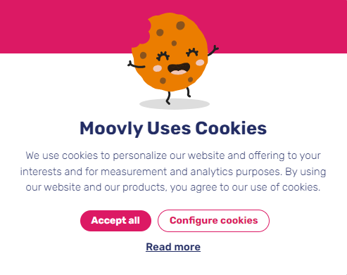
Here’s another good example of how to do it right: “Accept all” because if cookies don’t bother you, why fuss? But if you feel like changing your preferences, there’s “Configure cookies” right there for you. Everything is clear, straightforward, and positive.
source: moovly.com
A well-written cookie banner microcopy shouldn’t send users running for the hills. Instead, it invites them to stay with a warm, friendly tone. It also explains briefly but communicably what the cookies actually do. This way you don’t only respect the user’s autonomy but also enhance their experience on your website by eliminating any unnecessary stress or confusion.
source: waze.com
CTAs on Buttons
What’s the secret to an effective call-to-action (CTA)? It’s simple: make clear what’s in it for your users, quickly and without fuss. At Delante, we cut straight to the chase by letting you know our estimates are free.
an example of a clear message on a CTA button
Just like that. You click, you order. We tackle any hesitations before they even have a chance to pop up.
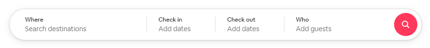
Convenient and Functional Actions
Ever noticed how effective personalized actions are? Consider how it works with AirBnB. The UX writing and microcopy clearly direct you to select your destination, check-in details, and number of guests. This way, you immediately understand what’s about to happen next – you’ll see listings that match your preferences. Super straightforward, isn’t it?
source: airbnb.com
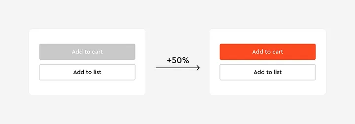
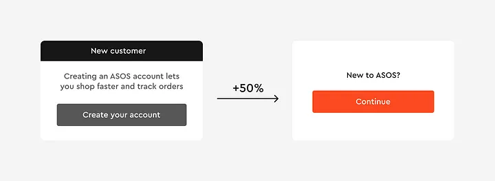
Simple Words, Simple Colors
Spaceberry recently published a case study showing that Asos, by changing the color scheme of their buttons and the text content, increased their click-through rate by 50%. Why write long sentences that no one has time to read when you can simply ask if someone is new here and ready to create an account?
source: blog.spaceberry.studio
source: blog.spaceberry.studio
What Are Microcopy and UX Writing? Let’s Wrap This Up!
UX writing covers everything from the words on your buttons to the messages that pop up when something goes wrong, the descriptions of what your app does, and even how your brand sounds to people. The goal? Make everything easy to use and understand.
Microcopy is all those little bits of text you run into, like the nudge on a button, the heads-up in an error message, or a quick tip. The best microcopy is clear, gets straight to the point, and feels like a friend giving you a hint.
3 reasons why microcopy and UX writing really matter for getting people to click, buy, or sign up:
They clear up any confusion about what you’re offering and how to order/use it.
They guide you through the website smoothly, so you never feel lost or annoyed.
An editor by profession. She has been working in marketing for the past 5 years — first in the social media teams of Krakow publishing houses, then in SEO and copywriting, until she finally decided to excel in content marketing and combine her organizational skills with her extraordinary linguistic sense of style. She works on content projects at Delante, conducting content audits, arranging content plans, and creating content for the most demanding clients. Privately, a cat behaviorist, future dog trainer, and a lover of tattoos and RPG games.
An editor by profession. She has been working in marketing for the past 5 years — first in the social media teams of Krakow publishing houses, then in SEO and copywriting, until she finally decided to excel in content marketing and combine her organizational skills with her extraordinary linguistic sense of style. She works on content projects at Delante, conducting content audits, arranging content plans, and creating content for the most demanding clients. Privately, a cat behaviorist, future dog trainer, and a lover of tattoos and RPG games.

 d-tags