d-tags

Why is user supposed to contact you through the website?
Nowadays, web developers and graphic designers are facing a real challenge. Apart from being functional and transparent, websites need to be eye-catching and attractive. During the first few seconds on the site, users decide whether to leave or continue browsing it. It’s also very important to make your page trustworthy. Gaining new customers is one of the main objectives of creating any website. However, in order for this to happen, the user needs to contact the person offering services or products.
Think like users – the proper website design
Users’ position on the website is a very important aspect. Visitors to your site need to feel safe, be aware where they are and have the possibility to enter another subpage or leave the page anytime they wish. A chaotic website may increase the bounce rate. Thus, it’s worth spending some time to think how to improve your site’s interface and attract even more potential clients. To be real, you have only a few seconds to incite users to stay on your website. The page has to be innovative, intuitive and it should provide as many essential pieces of information as possible. Try to get rid of unnecessary elements that only clutter the interface.
Call to Action
Are you wondering how to encourage users to contact you? There are many methods, however, CTA – a Call to Action button – is the most common and effective one. It should be placed in different parts of the site so that users can easily notice it. However, it’s important to find a happy medium and not overdo it.
The CTA aims to create a kind of path for the clients which will lead them to contact the company.
Obviously, there are many reasons why your clients could contact you and it’s essential that they realize what’s their reason. The most frequently applied CTA contains messages like “contact us”. Many websites offering various services, including Delante, use the “get a quote” button. Thanks to it, by providing your website address, email and phone number, you can efficiently receive an offer suited to your needs.

It’s a good idea to match the content of your CTA to the industry in which you operate. Remember that it’ll bring satisfactory results only when it’s conspicuous and natural. Place your button under the offer, so that users, after familiarizing themselves with it, can easily contact the company.
Highlight the key contact details
Users still don’t contact you through the website? Well, maybe your contact details are incomplete or placed in a totally invisible place? Remember that nowadays people love comfort. If you don’t make it sufficiently easy for them to find the contact data, they’ll leave your site sooner or later.
To make your life easier, place your contact details in your menu – for this purpose you can use the footer or the “contact” tab. Moreover, these pieces of information need to stand out from other elements on the website.

How to improve the visibility of your contact data? First of all, choose bigger font or bold the text. It can be very beneficial to highlight the phone number or email address by using a different color. Little icons matching given contact forms will also work great.
Be your clients’ guide
Most users searching for quality content may be redirected to your website straight from the search results. The question is whether they are transferred to the home page or to a specific subpage with the information they’re looking for. It’s important to ensure that potential clients know what to do in such a situation. The site’s interface should be transparent and user-friendly. Users need to know if they’re supposed to read an article, take action or maybe go to the contact form. Therefore, it’s worth designing your website in a way that will guarantee that people visiting it will take exactly the steps you care about.
Be your clients’ guide! Interest them in your offer, even if they aren’t sure what exactly they’re looking for. Recommending the most frequently purchased products, the best blog posts or the most attractive packages can increase their potential interest and lead to interaction.

Make sure that your menu is clear already at the stage of designing the site. After all, this is the element that guides the visitors through the page. Implement only the most relevant tabs, too much unnecessary information may confuse potential clients and consequently make them leave the site.
Blogging matters!
There are many companies which have already seen for themselves that blogging has a positive impact on the brand image and improves customer awareness. Not only Google appreciates valuable content. The menu of your website should contain a tab which will redirect users directly to the blog. Obviously, all of your entries need to be unique, comprehensive and published regularly.
Remember that people love commenting on blog posts. Respond to comments regularly in order to improve your brand image. It’s also important to reply to negative remarks as this way you can show that you don’t treat yourself too seriously and, more importantly, you can convince others to your point of view.
User-friendly contact form and contact tab
The “contact” tab is one of the most important website elements. It should be situated in a visible place. Moreover, the most important contact details should be at the top of the page so that every user can easily access them.
Keep in mind that users more and more frequently browse the net on mobile devices. Therefore, it’s a great idea to make it easier for them to contact the company through the site – provide a clickable phone number and email address so that mobile visitors can contact you without having to leave the site and enter contact details manually. Your contact data should comprise basic information about the company, including its full name, phone number, email address, National Business Registry Number or tax number.
Contact forms should be easy and intuitive. It shouldn’t take too much time to fill them in and they ought to contain only the most necessary pieces of information.
It’s also important to ensure the option that will enable you to send a copy of the completed form or automatic message confirming sending of the request to the client’s mailbox. This way, users get proof that they indeed contacted the company. Remember to provide visitors with the time they need to wait for a reply. Statistically speaking, it’s much more likely that potential clients will fill in the form if they know how long they’ll need to wait for a reply.
Do you want to improve your brand image and earn customers’ trust? If so, publish a photo of a person who is responsible for contacting visitors who filled in the form. This creates a kind of relationship between the company and the client.
Be active in social media
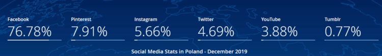
If you want to attract traffic to your website, then, social media platforms are a perfect method of improving your brand image. Be active on both general and industry portals. According to research conducted in December 2019, Facebook, Twitter, Instagram, Pinterest and YouTube are still among the most popular social media platforms, therefore, it’s worth being active there.
Being active on social media and bookmarking sites gives you endless possibilities. Your website should provide links to your most important and active social media channels.
Live chat on your website – is the game worth the candle?
Do you want to stay in touch with your clients? Contact data such as phone numbers and emails don’t work exactly as you’ve imagined? Maybe it’s time to try out the live chat that is getting increasingly popular and certainly has a few notable advantages. It often happens that users on the site want to get answers to questions that concern them immediately. This tool, characterized by short response time, will be ideal in this case.
The chat itself should inspire visitors to use it. That’s why it’s worth publishing a short text that will explain why direct contact with the service provider is a good idea. Live chats are very often more efficient than contacting someone by email which generally takes much longer. Provide the name and photo of the person responsible for answering the questions on the live chat as this will have a positive impact on your brand image.
Improve customer trust
Do you find it difficult to make users contact you? Your website has to convince new visitors that they can trust you. Reviews from other customers or clients who have already taken advantage of your products or services can do miracles. Although it may seem trivial and exaggerated, your website should mention all your company’s achievements and certificates or awards. After all, they confirm your qualifications and potential.
There is one more element that effectively draw visitors’ attention – numbers! Our eyes will detect data provided in numbers much faster than the same information communicated with text. Praise how many awards you’ve won, how many clients you’ve served, or how many employees work for your company.

Offer your potential clients free content such as guides or e-books. For even greater benefits, correlate them with your newsletter.
Why do clients leave websites without interaction?
There are numerous factors that may cause your potential clients to leave the site without making any contact:
- Firstly, the website loading time may be too long and going from one subpage to another can really test your visitors’ patience.
- Secondly, it often happens that users either have to wait too long to get the company’s response or they don’t get it at all. Such disregard can effectively discourage them from any other attempt to interact.
- And last but not least, the website’s interface may be so unattractive that any navigation on the site can turn out to be difficult or even infeasible. In such a situation, users will feel confused and consequently, they’ll quickly leave the page. Follow the tips in one of our previous blog posts to successfully reduce your bounce rate.
Conduct a thorough analysis of your website and make it as innovative and useful as possible. There are numerous factors determining whether a given user will become your potential client but the ones mentioned above are particularly important.