Psychology and UX Design in Action: Understanding User Thinking for Better Conversions

10min.

Comments:0

UX
Psychology and UX Design in Action: Understanding User Thinking for Better Conversions
26 October 2023
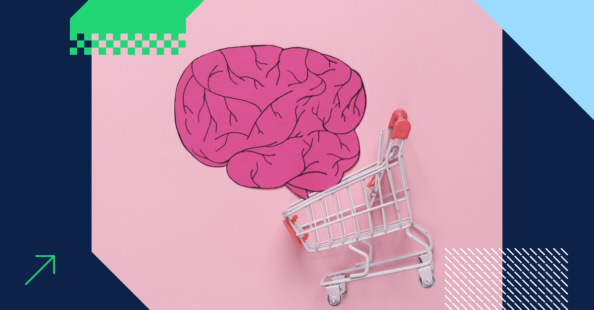
Have you ever found yourself on a website that felt like second nature to use? Everything seemed to fall into place, and you effortlessly got what you needed. Well, the secret behind it is the delightful combination of UX design and psychology. Stay with me and I’ll tell you how to use the latest UX principles to guide your customers seamlessly from your product pages all the way through the purchasing process.

10min.

Comments:0

Nowadays, making your website a joy to use is just as important as the products and services you offer.

Also, you probably know that having an endless array of amazing products won’t get you anywhere unless the user experience you offer is at least good. But, of course, it would be best if your website’s user experience were superb.

But what does a superb user experience really mean? Is it all about having a clean and easy-to-navigate interface? Maybe, as Steve Krug says, it’s about making things so straightforward that users don’t have to think before interacting with a website.

And it’s not that your customers are lazy or not smart – not at all! Think of them as people checking your website while riding a noisy bus, watching their favorite TV show, or rushing around.

In other words, internet users don’t always have the time or patience to focus entirely on the shopping process. That’s why you need to make their browsing experience smooth, simple, and intuitive. That’s where the combo of psychology and UX design comes into play.

This means that if you want your visitors to take action – whether it’s filling out a form, watching a video, or making a purchase – you should take a close look at the principles of UX design and psychology. You need to understand how users behave in order to make it work for you.

Let’s begin at the heart of UX design and psychology, and see how people make sense of the confusing things they look at and hear.

Where It All Started: The Gestalt Principles for User Interface Design

The Gestalt Principles are a set of ideas that describe how people tend to perceive and organize visual information. It’s about understanding how our brain:

  • groups similar-looking elements
  • recognizes patterns
  • simplifies complex images when looking at objects

In simple terms, they explain how our brains naturally make sense of what we see.

Designers use The Gestalt Principles to make sure elements on their websites look good and are easy to figure out, regardless of the screen the visitors use for interaction.

Interestingly, this “putting things together” principle (because this is how the word “Gestalt” can be roughly translated) has been valid since the 1920s! Apparently, humans haven’t changed much about our inner need to make order out of chaos. Or rather, our brain hasn’t changed much in the way it tells our eyes to see a bunch of small pieces as one big picture.

So, below you’ll find 6 Gestalt Principles that UX designers love to use to make outstanding user interface designs, keeping everything in the right place.

graphic representation of Gestat Principles

source: Uxplanet

Closure

This principle suggests that our brains tend to fill in missing parts of a picture or object to perceive it as a whole. Even if something is not entirely there, we often see it as complete. Sounds confusing? Then look at the below FedEx logo – can you see the arrow made of E and X? This is the perfect example of Closure.

FedEx logo

source: FedEx

How can you use the principle of closure in your web design? For example, for your interface icons or to indicate more content than you can display on a screen, just like HBO does that on their homepage. Notice how the movie images are sliced in half, making us curious to scroll left to view the complete image.

HBO homepage using the Closure principle

source: HBO homepage

You don’t need to see the entire image to understand what it depicts, especially since it’s placed among other movie images. Your brain figures it out, but it might still prompt you to scroll left to confirm your hunch.

So, have a go at the Closure principle to use the natural human tendency for recognizing patterns and encourage users to explore your content further.

Proximity

When items are close to each other, we tend to see them as related or part of a group. If things are spaced apart, we see them as separate.  This is the main point of Proximity. Now, take a look at the yellow dots below

10 dots showing the proximity principle
They all look identical, don’t they? Yet, for some reason, it’s highly likely that your brain considers the first 6 dots as grouped together. This tells us that the closer objects are to one another, the more related our brains consider them to be.

How can you use the Proximity in your UX design? For example to create a visual hierarchy and improve readability in navigational menus, forms, product pages, and footers. Just look

a bad and good example of grouping similar objects related together for better UX

source: Uxmisfit

Proximity helps you organize related elements and action buttons close to each other. This makes it easier for your users to quickly figure out what information belongs to which element, and what happens when they click a button. In short, it simplifies the process for users to swiftly scan content and accomplish their tasks.

Let’s take a look at yet another example:

bloomberg's footer

Bloomberg’s footer

The Bloomberg website’s footer really shows the Proximity idea in action. Even though all the elements have the same color and font, the way they’re put together makes it clear that some of them are related as they belong to individual groups.

Similarity

If objects have similar attributes, like color, shape, or size, our brain tends to group them together and see them as related. Below you can see the Similarity principle in action – can you recognize which grouping indicator is used on the Asos website?

asos webiste showing the similarity principle

If your answer is “shape,” then you’re absolutely right! You don’t have to understand the words “gloves,” “beanies,” or “glasses” to recognize their connection. Just the fact that they share the same shape, like a rounded rectangle, suffices. This is a truly amazing example of how psychology and UX design work together.

And here’s the last question: Which grouping indicator is used below?

an example of similarity principle using colors

source: Synchrony

Color, shape, or size? Indeed, it’s the color that indicates that once clicked, the green elements will ignite an action.

Continuity

Here’s another wonderful tendency of our brain’s: it prefers perceiving smooth and continuous patterns rather than abrupt changes or disruptions. In other words, our brain tends to see objects placed in uninterrupted lines or curves as more connected than items on a jagged or disrupted line.

See the screenshot below to understand the principle of Continuity in action

a screenshot of Adidas homepage showing the continuity principle

source: Adidas

Besides the black-and-gray slider, which clearly tells us that moving it right reveals more, there’s also a small snippet of an image at the end of the photo row. Interestingly, it’s wide enough for us to identify it as a picture, but narrow enough to make us curious to slide it left and see the full image.

Use the Continuity principle to declutter your design and make your visitors engage with your website.

Symmetry

Symmetrical objects are often seen as more visually pleasing and balanced than asymmetrical ones. Also, the concept of symmetry in Gestalt psychology involves people seeing symmetrical elements as belonging to a single, cohesive group.

example of symmetry in web design
It’s not shocking that humans naturally seek order in things, and symmetry is one way to achieve that. This is why we find symmetry pleasing – it’s a straightforward, balanced principle that imparts a feeling of organization and correctness to objects.

Figure-Ground

We naturally separate objects from their background, distinguishing what’s in focus (the “figure”) from what’s in the background (the “ground”).

example of figure ground principle

source: Reebook

In other words, the Figure-Ground principle is about what we see as the main thing and what we see as the background in a picture or design.

Think of it this way: The “figure” is the main thing you focus on, and it’s usually the most important part of the picture. The “ground” is like the background or the space around the main thing. When UX designers use this idea, they want the website user’s brain to see what’s important (the figure) and what’s not (the ground) in their designs.

Simply put, use this principle to make sure your customers know what to pay attention to.

How to Prevent Tunnel Vision and Selective Attention from Ruining Your Conversion Rate

Imagine you’re looking through a narrow tunnel, and you can only see what’s right in front of you. In web design and UX, tunnel vision means your customer is so focused on one part of your website that they might miss other important things, like your CTA.

Amazon seems to know how to make the most out of human psychology and UX design – just look at the form below. Even if you didn’t know English, this juicy yellow button would make you click it, doesn’t it? By creating the attention-grabbing button in their minimalist design Amazon guides you the action they want you to take.

a screenshot of Amazon sign in form

source: Amazon

Due to the selective attention and tunel vision, the internet users notice some things and ignore others. With that being said, it’s your job to make sure the important stuff stands out, so your customers don’t miss it.

example of dealing with the vision tunnel

When you look at one of our pages, selective attention helps you see the “Free Quote!” and “Let’s talk!” buttons, even if there are lots of other things on the page.

Use those psychology and UX design techniques to guide your users’ focus to what matters most, which – in most cases – is clicking the CTA button.

Web Usability and Short-term Memory

Web usability is all about making websites easy to use. This idea is perfectly depicted in Steve Krug’s book title: “Don’t Make Me Think.” Indeed, if you want to make sure your users find what they want to find without getting lost, you should keep this golden sentence in mind while creating a user-friendly interface. And this is important, especially in terms of our human memory – especially the short-term memory.

You have to keep in mind that an average internet user can only remember a few things at once. In most cases, it’s around 5 pieces of information – this is the average capacity of our short-term memory.

When designing your web interface, keep important information close and easy to find.

Make sure that the most important information is prominently placed in front of users. This way, they won’t forget anything crucial and will have all the necessary details to make a purchase from you.

That’s why tables that allow us to compare a few products, showing their features in a clear side-by-side format, are such a great solution.

amazon product comparison table

source: Amazon

Here’s another great example of how to combine UX design and psychology: Display the number of items added to the cart and the total cost at the top of the screen. This design choice takes advantage of the limited capacity of your short-term memory.

shopping cart widget showing the total cost of items

source: booster.io

Your customers don’t have to remember what they added to the cart and do mental math to figure out the total. Such a solution, which most times is a mini cart widget, displays the information where your customers can easily see it, so they don’t forget or lose track of what they’re spending.

Clever Ways to Minimize Cognitive Load for Better Usability

Our brains have a limited amount of “thinking power.” Even though browsing the web is more relaxed than playing strategy games, we still need to think when we use websites. So do your customers.

They have to understand how to navigate your website, where things are, and how to do things like filling out forms. See the below tips to make every single step of the buyer’s journey as effortless as possible.

TIP #1: Avoid visual overload
Too many links, unnecessary images, or fancy fonts can slow your customers down. It’s like having too many things to look at. Useful links, images, and fonts are great, but when there are too many, it can make things confusing.

TIP #2: Use familiar designs
People already know how most websites work because they’ve been to other websites before. When a website looks and works like others your customers have seen, it’s easier for them to interact with it, which promotes higher conversion. By using familiar designs, you spare your customers time to learn how to find, buy, and pay for your products.

TIP #3: Make things easier
If your website asks users to read lots of text, remember things, or make tough choices, see if you can make it simpler. Maybe use pictures, show what they’ve entered before, or make some choices for them. This way, your users don’t have to work as hard, and they can save their thinking for what matters to them.

UX Design and Psychology: How Users Decide Where to Go Next

Have you ever wondered why people click on certain links when browsing the web and completely ignore others? Well, it’s all about following the scent of information.

Just as you can follow a scent to find something…

People on the internet follow clues to find the right information. These clues come from things like the words they see in a link, where the link is, and what’s around it. If the clues make sense and seem promising, they’re more likely to click on a given link.

So, think of information scent as the trail of breadcrumbs that help your website visitors find what they’re looking for. Your job is to make this trail clear and enticing.

Here’s how you can do it using UX design and psychology:

  • Use clear link labels. The words in your links need to be straightforward and match what’s on the other page.

    For example, if your website sells shoes, a link that says “Browse Running Shoes” is much better than “Click Here.”
     
  • Place links in the right context. Imagine your website as a big book with chapters. When you add a link, make sure it fits naturally within the content.

    For example, if you’re presenting hiking gear, a link to a blog post titled “Top 10 Hiking Trails” should be somewhere nearby. This makes it easy for visitors to follow the trail to what they want and are genuinely interested in.
     
  • Create genuinely useful descriptions. When you include a short description next to a link, it’s like giving your visitors a quick preview of what they can expect to see after clicking on the link.

    For example, if you have a link for a blog post about healthy recipes, a short description like “Delicious and Nutritious Meals” can make visitors more likely to click.
     
  • Use only relevant images. If your link is related to a product, a picture of that product next to the link is like a visual cue.

    For example, if your website sells laptops, having a clear image of the laptop next to the link for “Latest Laptop Models” helps visitors quickly understand what’s being offered.

So, think of your links as scent trails. The better the scent, the more likely your users will follow it and enjoy the information at the end of the trail.

Takeaway: Psychology and UX Design in Action

What you’ve just learned is that having a website that’s easy to use is just as important as the quality of products or services you offer.

This is why you need to adapt UX design and psychology to understand how people think and behave subconsciously while browsing a website. You can do this by following these takeaways:

  1. Use Gestalt principles – apply design tricks like grouping similar elements and creating a clear visual flow on your website to make it look organized and pleasing. This helps users understand your content better.
  2. Highlight important elements – key conversion-inducing elements, like buttons for buying or signing up, should stand out. Make them easy to spot to combat tunnel vision.
  3. Give your visitors what they expect – speed up your website so it loads quickly, and make sure that links change color after they’ve been clicked. Also, use clear and simple words for your links so the users understand what they mean and where they lead.
  4. Keep things simple – try to reduce the things users have to think about when they’re on your website. Don’t clutter it with too much information. Instead, organize it nicely.
  5. Guide user clicks – remember that users follow information scent to decide what links to click. So, use clear labels for your links, place them where they make sense, and add helpful images or short descriptions next to them.

Now that you’ve got a better grasp of how the human brain works and what the essential UX principles are, you’re all set to make your website user-friendly, where clicks, purchases, and conversions happen smoothly.

So, feel confident to put what you’ve learned into action. Make things simpler for your visitors, use the tips we’ve discussed, and see your online business grow stronger.

However, if you ever run into a problem or want a fresh perspective to ensure your visitors have a good experience with your website, remember we’re here for you. Feel free to reach out or simply ask us to run UX, CR, CX analysis. We’ll look into your conversion path to identify any issues that may drive your customers away from making a purchase.

Gosia Chłopicka Marketing Delante
Author
Gosia Chłopicka

Copywriter

A translator and copywriter who has been working in marketing since 2015. As a trained English teacher, she knows tricks for breaking down complex ideas, making them easily comprehensible for laymen. In her free time, she reads everything related to Scandinavia and shoots wedding and sports reports.

Leave a comment

Get a
Free Quote

Awards

european search awards finalist