d-tags


- What is Web Accessibility? Definition
- What are Web Content Accessibility Guidelines (WCAG)?
- How to Make Your Website More Accessible? 8 Well-Proven Ways
- How to Check If Your Website Is Accessible?
- Make Your Website Accessible to All Users
What is Web Accessibility? Definition
Website accessibility is all practices designed to make all tools or digital products, such as websites, mobile applications, software, fully accessible to web users with diverse disabilities. As a result, no user experiences barriers that would make it difficult or even impossible to use particular digital products.
Web accessibility takes into account different types of disabilities concerning auditory, cognitive, neurological, physical, speech, and visual impairments. Importantly, web accessibility also applies to people without disabilities, who are in situations that make temporary access to a digital product significantly more challenging. These can be, for example, users with broken arms or lost glasses, people who have a slow or unstable Internet connection, people using mobiles with small screen resolution, or elderly people.
Web Accessibility and Business Opportunities
It turns out that web accessibility plays an important role in business success as well. Accessible design allows you to improve user experience and the feeling of satisfaction from using your website or mobile application. What's more, with web accessibility you ensure equal access to your digital product for all users: young or elderly, with or without different disabilities, people in rich countries, or in developing countries where access to high-tech devices or the Internet is far more limited. Simply put, by not excluding any users you increase your audience range and enhance your brand.
Web Accessibility and Legislation
The legislation is one of the main reasons why you absolutely cannot ignore web accessibility. As the Internet and online activities are becoming a practically inseparable part of our lives, in many countries equal access to digital products is not a good will but a legal obligation. Many nations especially in Europe, North America as well as partially in Asia and South America adopt the rules set out in the Web Content Accessibility Guidelines (WCAG) 2.0 in their legislation.United States
In this country, Section 508 Amendment to the Rehabilitation Act of 1973 was introduced to ensure that every digital product is fully accessible to all users with various disabilities. That means that absolutely every federal agency is obliged to follow this law and provide equal access to its information technology. Moreover, in 2017, Title III of the Americans with Disabilities Act (ADA) was introduced - its main objective was to fight discrimination against disabled people. So far, many lawsuits have been filed on the basis of ADA against owners of digital products that have not provided full accessibility to all users.European Union
In 2016, the European Parliament accepted the Web Accessibility Directive which means that every website and mobile application managed by public sector bodies in all EU member states must be fully accessible to all users.What are Web Content Accessibility Guidelines (WCAG)?
Web Content Accessibility Guidelines (WCAG) are recommendations developed by the Web Accessibility Initiative (WAI) of the World Wide Web Consortium (W3C) which provide guidance on how to make web content more accessible to users with different disabilities.WCAG 1.0
WCAG (version 1.0) was first published in 1999 and contained a list of 14 principles of accessible design to be followed. They have been divided by their priority level and indicated which guidelines must (Priority 1), should (Priority 2), or may (Priority 3) be fulfilled. The principles described in WCAG 1.0 related to issues such as:- providing clear navigation,
- using markup and style sheets,
- not relying only on colors,
- providing information for better orientation,
- using W3C guidelines.
WCAG 2.0
WCAG 2.0 were published in 2008 and contained recommendations divided into 4 main principles which indicated that every website must be: perceivable, operable, understandable, and robust. WCAG 2.0 describes techniques, which are regularly updated, to help web designers meet all the criteria to provide fully accessible design. WCAG 2.0 (just like WCAG 1.0) uses levels of concordance (A, AA, AAA) indicating the obligation to meet given criteria. According to WCAG 2.0, every digital product should, for example:
- contain alternative texts for all non-text elements,
- provide access to all functions from a keyboard,
- provide readable and understandable text content,
- ensure that each page can be operated in a fully predictable way,
- ensure that users can correct their mistakes,
- give users enough time to read text content.
WCAG 2.1
WCAG 2.1 is an upgraded version of WCAG 2.0 published in 2018 which was extended with other 17 success criteria. WCAG 2.1 focused primarily on providing guidance to make digital products more accessible to 3 main groups of users: with low vision, cognitive disabilities, and disabled users using mobiles.How to Make Your Website More Accessible? 8 Well-Proven Ways
1. Use Alt Text for All Images
If you have already optimized your website for search engines, you probably know that each image should have an alternative text, which contains the most important keywords, but you should be aware that alt text can be used for other purposes as well. Owing to alt text, all users with visual impairment, who use screen readers, have access to visual information. Simply put, this attribute added to each image is read by screen readers, allowing disabled users to find out what a given image contains. Adding alternative text to images is easy, and you can usually do it in CMS. This is how it can be done in WordPress: [caption id="attachment_36545" align="aligncenter" width="602"] Adding alternative text in WordPress[/caption]
2. Provide Captions to Your Video Content
Video is one of the most popular forms of content, that's for sure. But you have to remember that not only text or images on your website must be fully accessible to all users, but the same applies to videos you create for your website, blog, or social media channels, such as Vimeo, YouTube, or even Instagram Stories. So that every user can easily access all information in your video content, you must provide captions. They should be synchronized with the content and available on various devices: mobiles, desktops, and tablets. [caption id="attachment_36547" align="aligncenter" width="602"] Captions on YouTube[/caption]
3. Provide Correct Heading Structure
The correct structure of each page is a huge help for users using screen readers as it makes navigation through your content so much easier and more efficient. So you should provide correct headings to get the page well-structured in order to indicate which section is the main one and which is less relevant. This way, screen readers will easier interpret your content. As headings define the structure of your pages, they are extremely important for disabled users. Here are the key rules you need to follow to provide the correct heading structure to facilitate navigation for assistive technologies:- never skip headings - each page must have well-structured headings,
- each page should have one H1 heading - multiple H1 headings on one page are not well-supported by screen readers and may misinterpret the content,
- use subheadings (from H2 to H6) to define particular sections.
4. Use Contrast Colors
Before I explain to you what rules you should follow when selecting colors on your site, I would like to show you how colors are perceived by people with different color vision defects - protanomaly, deuteranomaly, and tritanomaly. [caption id="attachment_36549" align="aligncenter" width="602"] Deuteranomaly - reduced sensitivity to green light, the most common type of color blindness[/caption]
[caption id="attachment_36551" align="aligncenter" width="602"]
Deuteranomaly - reduced sensitivity to green light, the most common type of color blindness[/caption]
[caption id="attachment_36551" align="aligncenter" width="602"] Protanomaly - reduced sensitivity to red light[/caption]
[caption id="attachment_36553" align="aligncenter" width="602"]
Protanomaly - reduced sensitivity to red light[/caption]
[caption id="attachment_36553" align="aligncenter" width="602"] Protanomaly - reduced sensitivity to blue light[/caption]
So, as you can see, there is more than one type of color blindness, and you have to take them all into account when designing your website and choosing its visual layout. Remember that colors are not just for visual purposes only - they should convey information or indicate an action. To make your website more accessible to users with different types of color blindness, make sure that color is not the only one component of presenting information, use shapes, icons, sounds, different sizes as well.
WCAG also indicates a minimum contrast between text and images of text, which is 4.5:1. However, there are 3 exceptions to this rule:
Protanomaly - reduced sensitivity to blue light[/caption]
So, as you can see, there is more than one type of color blindness, and you have to take them all into account when designing your website and choosing its visual layout. Remember that colors are not just for visual purposes only - they should convey information or indicate an action. To make your website more accessible to users with different types of color blindness, make sure that color is not the only one component of presenting information, use shapes, icons, sounds, different sizes as well.
WCAG also indicates a minimum contrast between text and images of text, which is 4.5:1. However, there are 3 exceptions to this rule:
- large text: large-scale text should have a minimum contrast ratio of 3:1;
- incidental: purely decorative elements, which do not provide any significant content, do not have a defined minimum contrast;
- logotype: when it comes to text, which is an integral part of a logotype, there is no specified minimum contrast.
5. Make Every Form Easily Accessible
Forms are an integral part of practically every website. Maybe typically you don’t notice how important they are but even in every social media platform you need to fill a form in order to sign up, or in online stores, you need to provide all the necessary information in order to complete the transaction. And on your site, you must design all forms to be as accessible as possible. How to achieve that?- Make sure that each field is properly labeled.
- Provide information and instructions on how to fill in each field in the form correctly.
- Prevent errors: inform users immediately that some errors occur in their forms, even before they finalize the submission.
- Notify users when they fill in the fields correctly.
- If the form is long and contains many fields, divide it into several pages and inform users about the progress.
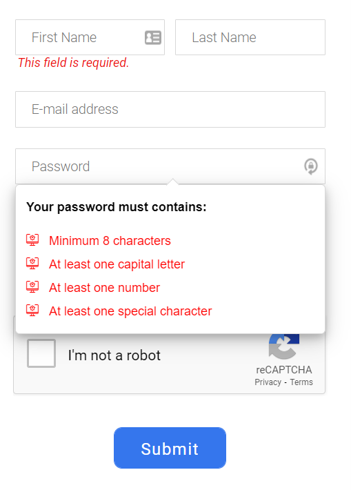 Sign up form in Visually[/caption]
6. Provide Informative Title Tags
When it comes to search engine optimization, title tags are, without a doubt, the most important element that has a direct impact on the ranking in organic search results. For that reason, many people just stuff title tags with keywords hoping that this way they will improve their positions. Well, this practice has nothing to do with accessibility. The content you place in <title> is the first information that the user gets when using screen readers, so make it as accessible as you can. Remember to:- include in the title tag the most important information about the content and purpose of the page;
- not to stuff <title> with keywords - make the title tag relevant;
- follow the best SEO practices.
7. Make the Navigation Consistent and Intuitive
Above I've already described headings and how they allow you to introduce well-structured and correct web navigation, but navigation is so much more than that. So if you want to design accessible web navigation, keep in mind the following issues:- Each page within your site should have a similar layout, so make sure they are built consistently.
- All visual elements that have a similar function (e.g. arrows, icons) should have a coherent form; in this way users will be able to easily guess what a given symbol means and what is its main function.

- Create a sitemap for complicated and complex websites - this way, some pages, and sections will be much easier to reach and users will not get lost when browsing through your website.
- Breadcrumbs may be a huge help as well - they will indicate to users how they got to a given page. If you would like to learn more about breadcrumbs and their importance in SEO, check the entry on our blog which will tell you everything you need to know about breadcrumbs.
8. Enable Resizable Text
All users using different types of devices or browsers should be able to resize text. This feature is extremely useful for users with visual impairments. That's why you should design your website in such a way to make it possible to resize text and not to destroy the layout of your website completely. It’s best to use relative sizes that enable text to be scaled. WCAG points out that text should be scalable up to 200 percent without losing its functionality and relevant content. When it comes to text spacing, WCAG prepared some guidelines you need to follow:- space between paragraphs should be at least 2 times the font size;
- line height should be at least 1.5 times the font size;
- tracking (space between letters) should be at least 0.12 times the font size;
- space between words should be at least 0.16 times the font size.
How to Check If Your Website Is Accessible?
If you want to check whether your website is fully accessible and meets all the requirements provided by WCAG, there are several ways to do it:WAVE Web Accessibility Evaluation Tool
This official tool developed by WebAIM and constantly updated since 2001 will show you all accessibility errors on your website. You can also add it as an extension to Chrome or Firefox. With WAVE, you will be able to check if the structure of your website is correct if the color contrast is sufficient if all non-text elements have alternative text, and identify missing form labels or empty buttons and links.
Lighthouse
This Chrome and Firefox extension developed by Google provides all the information you can use to improve the performance and quality of your website. This tool generates a report with final scores in 4 categories: performance, accessibility, best practices and SEO. If you would like to find out whether your digital product is accessible, just move to the main Accessibility report where you will find all the elements that need to be optimized or improved.